Every year, web design agencies, CRM publications, and other industry thought leaders throw together articles about the year’s latest web design trends.
Usually, these are new takes on old trends, a new way to design content, or innovative ways to create a better experience for your visitors. Sometimes, they really are just about making the page pretty — but they still count.
Some of these trends remain for years, like sticky headers and hamburger menus, some come and go, like colour gradients (spoiler: they’re back in a big way), and others are just short-lived, like sliding banners (these are a no-go with no sign of resurgence).
You can’t necessarily predict which trends will go the distance and which will fall by the wayside. What you can do, though, is be thoughtful about how you use and implement web design trends and make the impact, purpose, and convertibility a big priority.
Let’s take a look at some popular web design trends and how they affect convertibility.

Before we start, it’s important to note that not every trend will work for every website
There’s no need to note down every trend and immediately apply it to your website — nuance is definitely key. If you’re a law firm or a business specialising in chartered accounting, we’d probably ditch the quirky typeface and illustrations.
Responsive design
We wouldn’t necessarily call this one a trend, but it is here in a big way. Why isn’t it a trend? Because it is 100% here to stay.
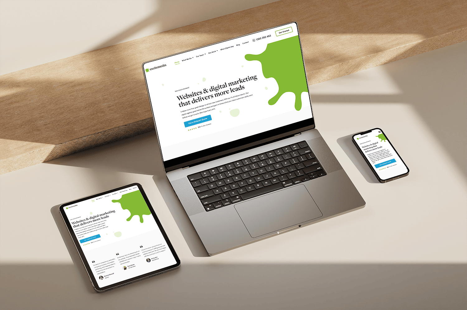
Responsive design is where your website responds to different devices and screen types. The page adjusts to fit a desktop, mobile, or tablet, and things like menu items might get bigger when a finger is required to click rather than a cursor.
Responsive design isn’t going anywhere, and in 2023, it’s a must-have — one you can’t compromise on.
How does it boost conversion?
Responsive design is all about creating an excellent experience for the people who land on your website. By making sure anyone can access your website from anywhere, you can lower your bounce rate and boost not only the number of visitors you get but the time they spend on your website.
It’s like they say, you’ve gotta be in it to win it.
We’re in a mobile-first world now, meaning your website needs to work on mobile phones as a minimum requirement. Doing this will get you better results on Google and better results on your website.
Minimalism
Minimalism in web design is just that — a minimalistic design. Less is more, and that is absolutely true when it comes to your web page.
Where minimalism in interior design means a bare-bones yet considered space, minimalism in web design is all about keeping the use of elements down and ensuring that the elements you do use are well-considered.
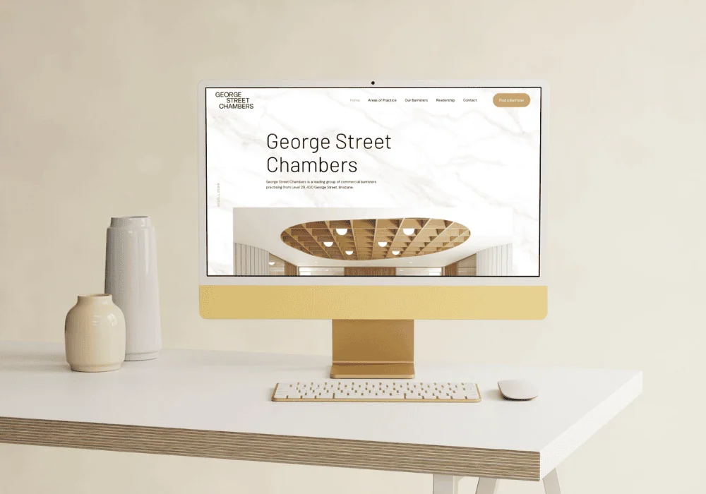
Here’s a minimalistic web design we created for George Street Chambers.
How does it boost conversion?
Each page on your website has a message — usually, it’s the unique selling point of your business or the benefit of choosing you. The more elements on a page, the more your message has to compete against.
We’re not saying that the key to conversion is to chuck a black-typeface message on a white background and be done with it. But by limiting the distractions on the page and being thoughtful in your layout, you can improve the experience your visitors have, make it easy for them to find what they need, and make your message loud and clear.
Particularly for professional services too, these designs can create better trust as they offer a more sleek and sophisticated look.
Plus, a minimalist design means your site will load quicker, which is a box ticked by Google when it comes to your rankings.
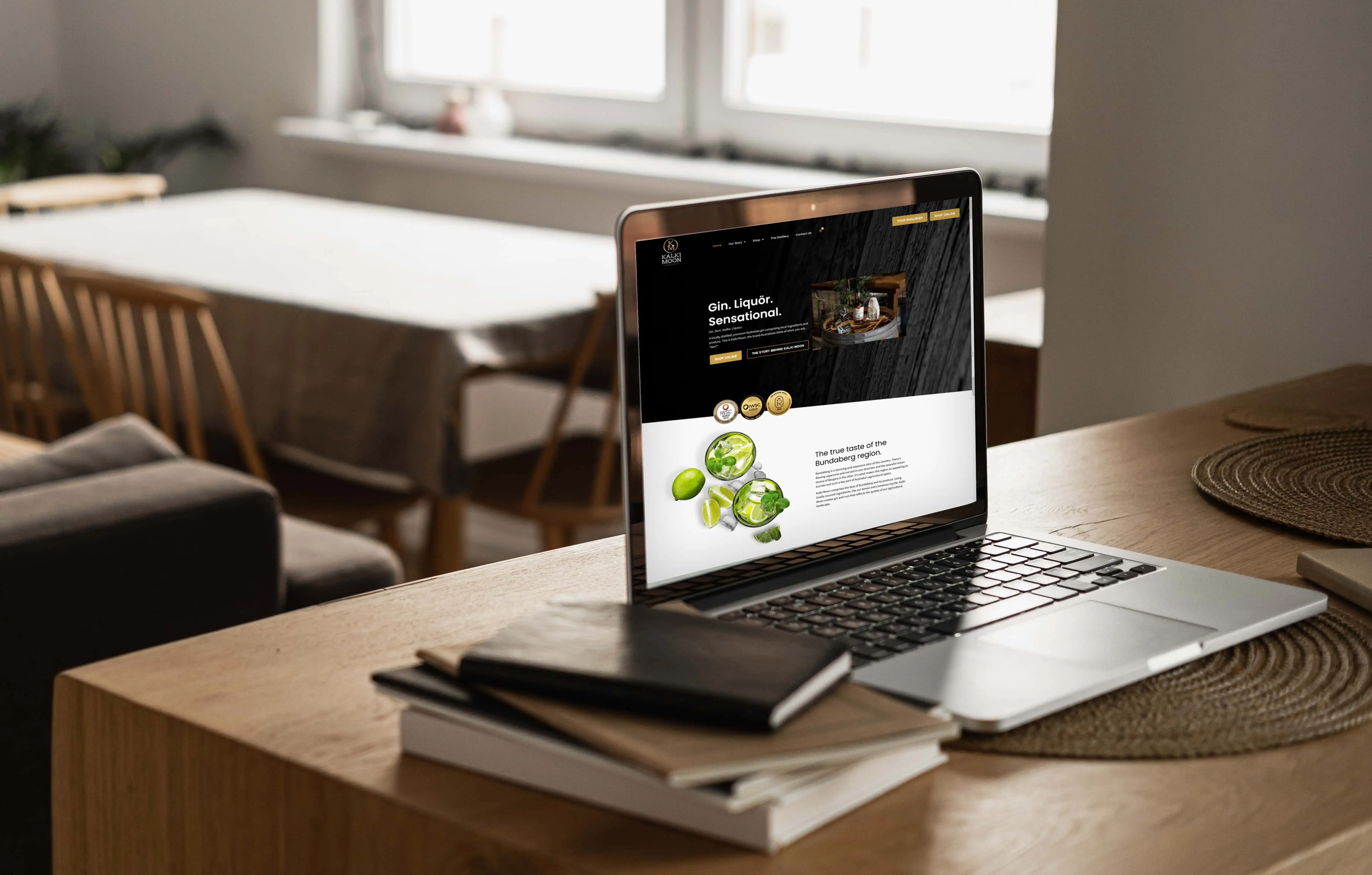
Bold typography
Web designers are loving a bold typeface right now, and it makes sense. It’s an amazing way to boost the impact of individual words and messages on your website and subsequently boost your site’s conversion rate.
It is, of course, essential that these bold types are legible and used sparingly, though.
How does it boost conversion?
By boosting the visual impact of certain elements and messages, you can boost your conversion rate. You can use bold words and headings to bring attention to the most important elements on the page, and you can marry your company’s branding with your web design.
These subtle points of difference help your visitors understand the page better and make their way to your ‘Contact Us’ page.
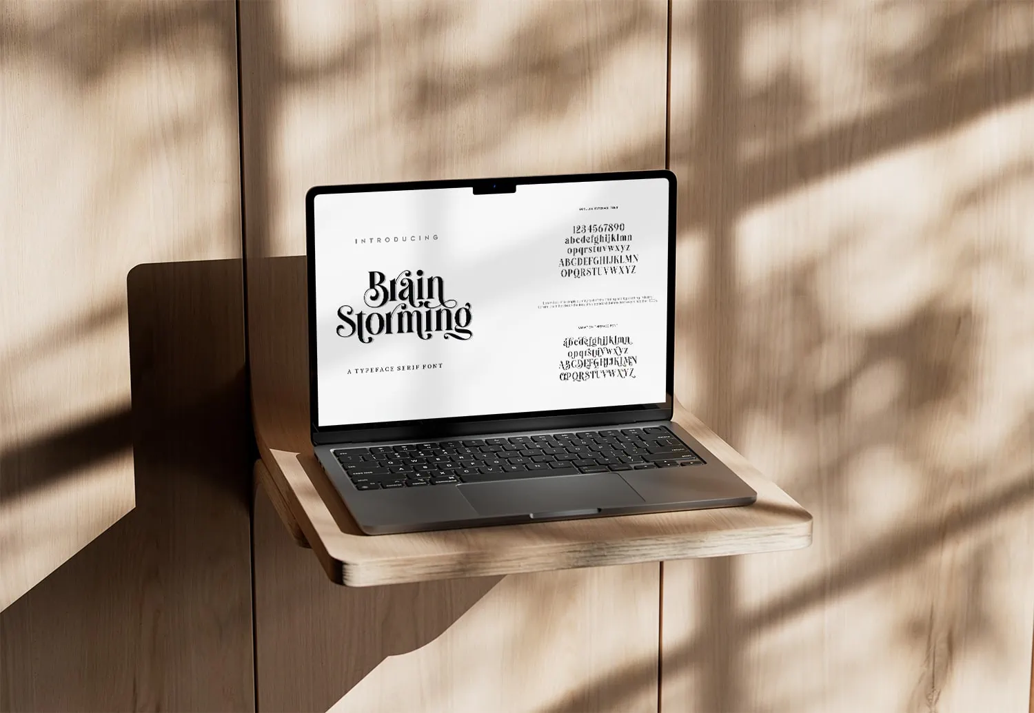
3D elements and illustrations
Sometimes, you don’t have photography, or it doesn’t make sense to hire a pro. And sometimes, stock photos won’t cut it either.
When used well, illustrations can create a serious impact in your design and how your website converts.
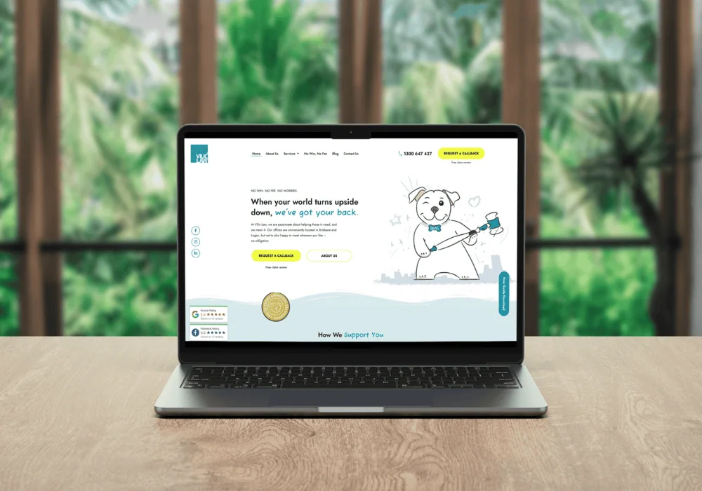
Here’s an illustration-based website we created for Vilic Law.
How does it boost conversion?
Illustrations can firstly just add a really handy visual aid in lieu of photography. But when it comes to complex products or services, these really can create serious benefits.
They can explain how your product works and simplify concepts that would be otherwise pretty hard to grasp.
And for products or services that aren’t necessarily complex, but professional photos maybe won’t work, illustrations can create an emotional connection with your visitors or set the tone for your business.
Even Illustrations like arrows or footsteps that take the visitor down the page can seriously boost your conversions. It’s even better if these are animated, but we’ll get to that soon.
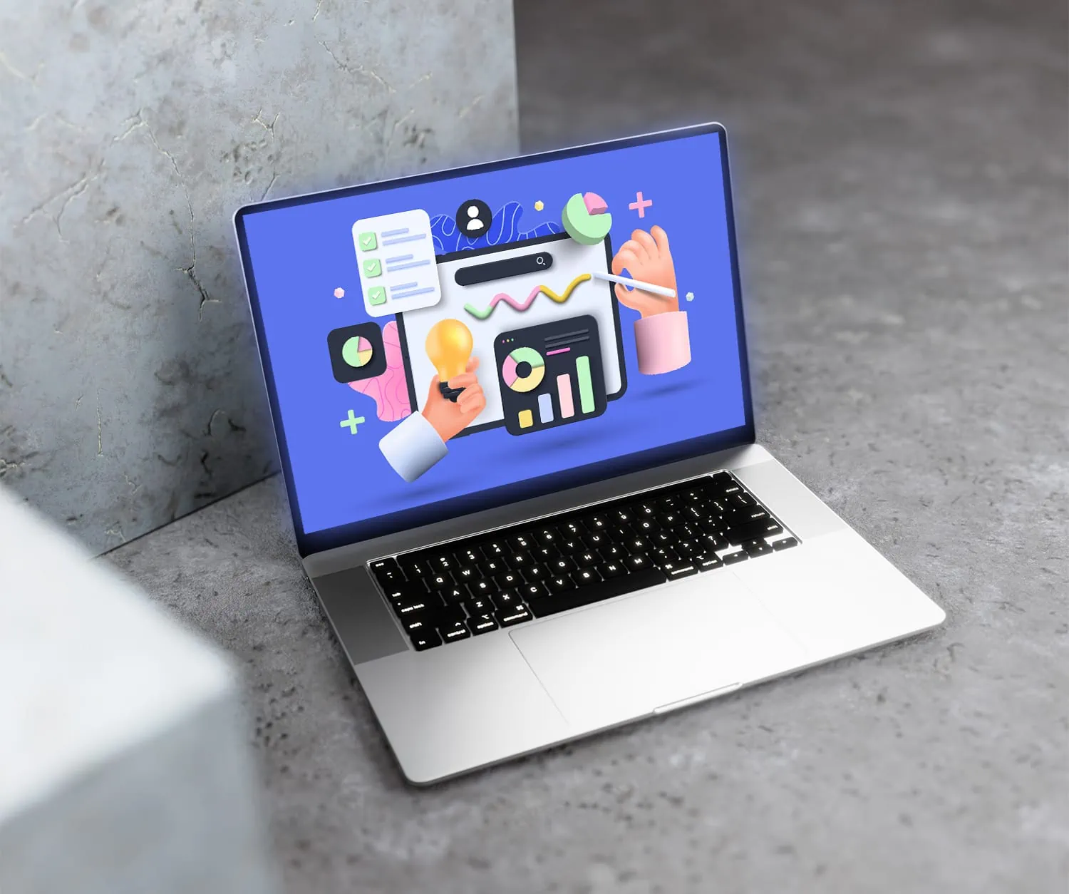
Gradients & creative colour patterns
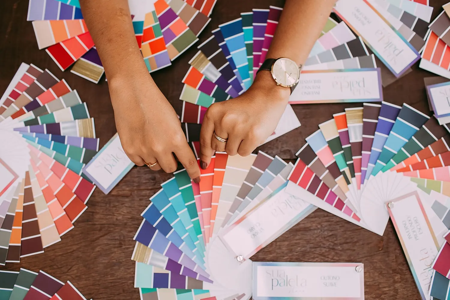
A gradient is where two colours start on opposing sides and meet in the middle. These create a point of interest in backgrounds and different design elements and are a really neat way to incorporate your brand’s colours into your website.
Creative colour patterns that incorporate fun and unique shapes and patterns are another amazing way to achieve that point of interest in your design.
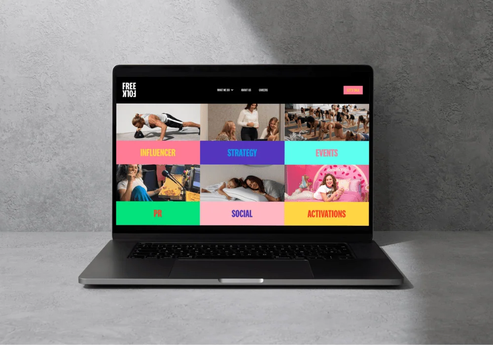
Here’s a bright-coloured design we created for Free Folk Agency.
How does it boost conversion?
Visual appeal matters in web design, and the fun incorporation of colours in your website’s design achieves just that.
Obviously, it’s important that these are used in a way that is true to you and your brand — there’s no need to introduce a bunch of new colours that don’t go with your brand in the slightest.
And again, you can use this trend to create visual impact in your design. Sometimes in web design, we’ll emphasise a word using a colour highlight. A gradient is a new and fun way to highlight words or headings and add impact to your message for better convertibility.
Asymmetrical layouts
Asymmetrical layouts are where the elements aren’t all placed symmetrically going down the page. The idea is that the design is still created thoughtfully and well-balanced, but the lack of symmetry makes a point of interest on the page.
This design trend isn’t for everyone, especially not businesses in professional services. But it can be really impactful for beauty brands or craft beer, for example.
How does it boost conversion?
These layouts add a unique touch to your website’s design and can help you achieve your desired vibe on your website. Depending on how you pull it off, it can make your brand look cool, edgy, or a little bit quirky.
You can manipulate the layout to emphasise the most important aspects of your website, too — helping you boost your conversion rate again.
On the flip side, though, an asymmetrical layout done poorly can sometimes result in a cluttered, messy look. It probably goes without saying, but that isn’t ideal for your conversion rate.
Micro-animations and interactions
Told you we’d get to animations.
Have you ever been on a website and moved your cursor over an element and made it move? It’s pretty cool, hey? These are called micro-animations, and while they may seem like something that’s just a new trendy way to beef up your web page, they can actually have an impact on the performance of your website.
How does it boost conversion?
These tiny animations can make the website feel more responsive and interactive. They also tend to keep users on the page for longer because they’ve spent that time playing with the page — this gives you SEO brownie points and means they feel more comfortable with your website.
Just like with illustrations and gradients, these animations can take your website visitors down the page towards your call to action.
Basically, these animations create a fun and engaging experience for your website visitors, which can often seal the deal and make your website visitors convert.
Book a free website strategy session
Review your website with Andrew to find out what you can do to improve it. Walk away with a list of recommendations to convert customers on the spot.

